The Up and Downsides to Image-Only Lead Generation Emails

Email is one of the most effective marketing channels, and according to the DMA in 2019, the average return was $42 for every $1 spent. It’s no wonder it’s a no brainer for generating leads.
What seasoned email marketers know, however, is that email marketing comes with a whole slew of intricacies: advanced responsive HTML rendering knowledge for all screens that support media queries, mobile-first design for B2C, desktop-first design for B2B, best practices do’s and don’ts, authentication and deliverability do’s and don’ts, personalization setup, dynamic content programming, list hygiene best practices … the list goes on. There is a lot to know and a lot to do to send an email that adheres to all email best practices, which means more billable time. You couldn’t possibly fully understand unless you’ve been in the trenches trying to deploy a marketing email with a deadline chasing you down.
Lead generation and sales emails by nature are fast, furious and try to catch the most fish on the smallest amount of bait. To do this, emails are typically image only instead of using the best practice rule of “80% text and 20% image.” Image-only emails are faster and less expensive to develop. The email design is one big image that should ideally be sliced up into many smaller images, and the smaller images put into an HTML format. The image-only email is deployed and can be displayed by a recipient only if they take a step to download the images. If you are deploying emails like this yourself or having a third-party lead generation company deploy on your behalf, then you need to be OK with:
- Outlook and other email clients suppress images by default.
- Most recipients won’t click the download images button to read your email.
- ISP spam filters do scrutinize image-only emails because of larger HTML file size.
- Recipients’ email client junk/SPAM folders do scrutinize image only emails because they have characteristics similar to SPAM emails.
There is no doubt though that the speed/cost to develop an image-only email from start to finish is way more attractive than the speed/cost for a fully responsive HTML email. That’s why I would only recommend going with image-only emails for lead gen emails, and there is a right and wrong way to do them. When it comes to taking shortcuts, you want to make sure you aren’t hitting a dead end.
When developing an image-only email, be sure to follow these four best practices:
- Do not skip all other deliverability best practices.
- Slice the big image up into smaller pieces.
- Use image alt tags in the code of the HTML to display text that makes sense to a recipient who doesn’t download images.
- Craft a stellar subject line that motivates a recipient to open your email and download the images (remember ESPs can only track an open in reporting if images are downloaded or a link is clicked).
So, let’s evaluate a few examples:

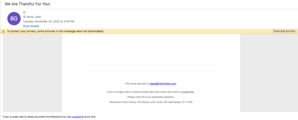
- +They sent from a domain with authentication with the ESP so it was able to reach my inbox.
- –They used one big image instead of slicing the email up into many small images.
- –They did not use an ALT tag to display text where an image is to help the recipient understand what the email is about.
- –The subject line does not tell me what the email is about either.
- –The only action a recipient can take on this email without images displayed is to unsubscribe.

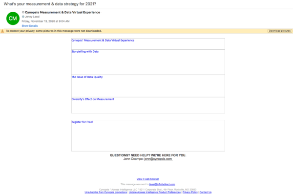
- +They sent from a domain with authentication with the ESP so it was able to reach my inbox.
- +They sliced up the big image into smaller images.
- +They used an ALT tag to display text where an image is to help the recipient understand what the email was about although …
- –The ALT tags are a bit vague and don’t really tell you what the image would be.
- +The subject line does intrigue the recipient to open, especially if they are concerned with planning for 2021.

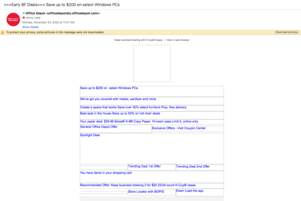
- +They kicked up authentication several notches by implementing BIMI/VMC.
- +They sliced up the big image into smaller images.
- +They used an ALT tag to display text where an image is to help the recipient understand what the email is about.
- +The subject line shows the recipient exactly what to expect when opening the email.
If you need your email recipients to fully comprehend your message and understand what it is you want them to do, then stick with a fully developed responsive HTML email. This will make sure that even if they don’t download the graphics your text and call to action are not missed. If you need the speed and are willing to accept the downsides to image-only emails, make sure you follow the four best practices to give you the best chance for success.
