
Digital Images 101 for Marketers

To the naked eye, images for print and digital might look the same, but what you don’t “see” matters the most. A common mistake when creating images bound for a screen is using a resolution that’s way higher and larger than required to get approvals. Once the image is sized down per the specs of where the image will be placed, you no longer can read the text, the logo degrades and the other elements in the image now look fuzzy.
The frustration is real but can be avoided by creating images to spec in the first place – factor in all the following BEFORE you start:
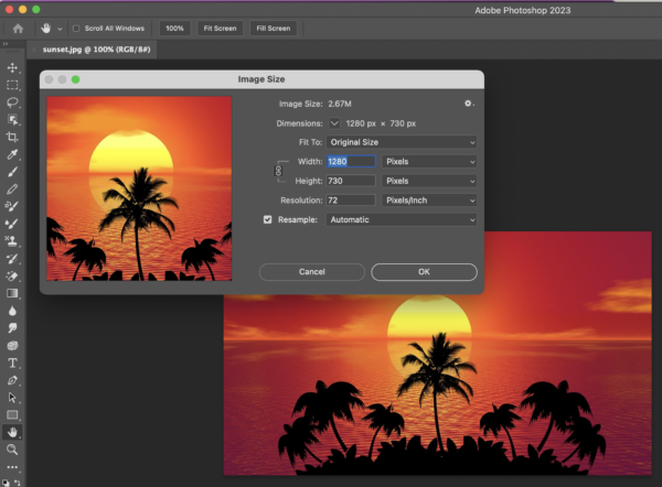
Image Size
Image size for print, for example, is usually measured in a unit of height/width like inches, centimeters or millimeters. For digital images, image sizes are measured in pixels – a single, minute area of illumination on a display screen that’s combined with many pixels to compose an image. Pixel dimensions for an image need to be exactly what the specifications call for. The images should not be created at a higher size (or resolution) only to be scaled down.
Resolution
Higher-resolution images generally result in better quality. Ensure your images have sufficient resolution for the platform they’ll be used on. Print resolutions are typically set at 300dpi or higher. Digital images typically use a resolution of 72 pixels.
File Formats
Understand different image formats (JPG, PNG, GIF, SVG) and when to use each. JPG is good for photographs, PNG for transparency, GIF for simple graphics or images that animate, and SVG for scalable vector graphics. For most digital marketing channel specifications, JPG, PNG and GIF are used most frequently.
File Size
Everything factors into the file size of a digital image. I’m not talking about the size of the image like width and height, but the size of the file for the JPG/PNG/GIF that is usually measured in kilobytes (KB) or megabytes (MB). Some programmatic channels, like the Display ad network, have file size limits for images so they load correctly when an image impression is served in the web page’s ad space. A good rule of thumb is that digital images usually have a small file size. 30kb would be a typical web/email image. Display images can range from 50kb – 150kb. If you see a file size with MB, your images are too big.
Compression Techniques
Compress images without compromising quality. Use tools to optimize for small file sizes for faster loading, which is important for user experience and SEO. Compression is important for graphics destined for web pages, retinae display on MAC and iOS devices and email.
Aspect Ratios
Maintain consistent aspect ratios for branding. This ensures a uniform look across various platforms and devices. A 1:1 aspect ratio means a square image. A portrait orientation describes an aspect ratio like 4:5, where the height is greater than the width. A landscape orientation describes an aspect ratio like 16:9, where the width is greater than the height.
Color Mode
Be mindful of color mode (RGB for digital, CMYK for print). Ensure your images are in the right color mode to avoid color inconsistencies. Keep in mind that monitors may display colors differently on one monitor than other types of screens. It’s common for print to do a press check and compare the print piece with an approved color comp. For digital images, use a consistent viewing environment when evaluating images. It’s common to compare print to a Pantone color if matching to brand guidelines for a CMYK logo. Note that digital images are RGB, which is why you may see a slight color shift when switching from CMYK mode to RGB. It’s common now that brand guidelines include both a CMYK and RGB values for logos.
Alt Text for SEO
Include descriptive alt text for images to enhance accessibility and improve search engine optimization (SEO). This is important for images destined for a web page as well as an email because it ensures readers can read the text that describes an image that might not be visible to readers with a vision impairment.
Responsive Design
Optimize images for responsive design. Responsive design means a design that adapts to different screen sizes for web pages or email. This ensures they look good on different devices and screen sizes. When creating images destined for a web page or email, the most important thing to do is to make sure that any logo, text or imagery in an image is readable and still makes sense at many different screen sizes. For example, an email header that is 600 pixels wide might be readable, but when it flexes down for a mobile phone, it still needs to be readable.
Copyright and Licensing
Respect copyright laws and use images with proper licensing. Unlawful use of images can lead to legal issues.
Social Media Image Sizes
Different social media platforms have specific image size requirements. Stay updated on these sizes to ensure your images look their best when shared on social media. If you’re doing ads on social networks, each social network has their own specifications for image size, resolution and file size.
To ensure that your picture is worth a thousand words, keep all the above in mind when creating your digital images. No one wins if people can’t see, read or understand your image’s purpose. If you need help creating digital images to spec, let’s talk.