
Demystifying the Art of Crafting HTML Emails

Email remains a vital communication tool, and businesses rely heavily on it to engage with their audience. Responsive hypertext markup language (HTML) emails have become the standard for creating visually appealing and interactive email campaigns that look good on a variety of screen sizes. We’ll dive into the intricacies of crafting HTML emails to deploy inside an email service provider (ESP), exploring the essential elements, best practices and common challenges.
It all starts from a design of the email. The design is typically an image of what the email will look like once it’s done. Ideally, both a mobile and desktop design is supplied for approvals.
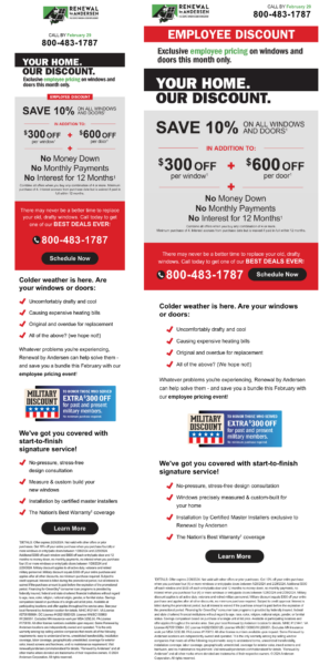
Many marketers think that this is where it ends, which is not the case. It’s only about 1/4 of the way done once a client approves the design.
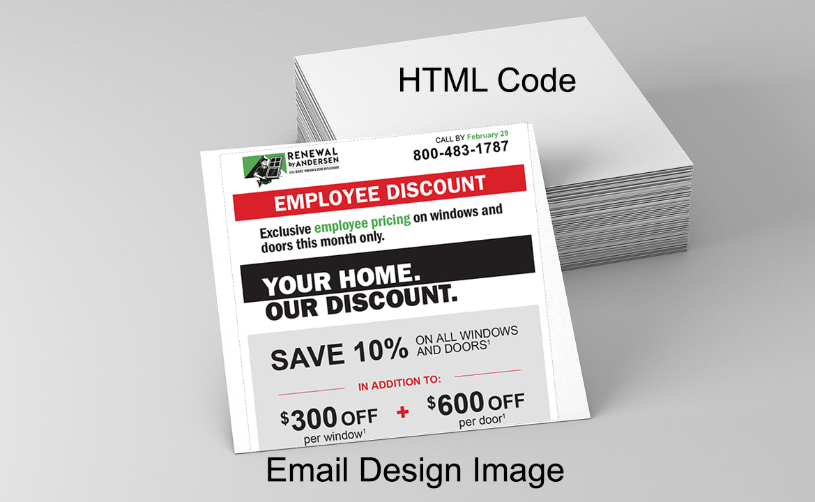
You do not want to code that design layout into an HTML template until it is 100% approved. In most cases, the text can be edited or changed once the design has been coded into an HTML template, but any changes to the layout (where content is located on the design) may require duplicating the coding step, which is the most time-consuming part of the process.
Oversimplified Steps:
- Design what the email will look like for desktop and mobile
- Design approval
- Slice the approved design into small squares (aka tables) and program in HTML how those small squares/tables display for different screen sizes.

Crafting HTML emails is both an art and a science, requiring a deep understanding of HTML, CSS and the historical knowledge of the rendering quirks of various email clients. The bottom line, it requires experience in addition to expertise to do it right.
If you’re a marketer on the technical side and curious about the general structure of an HTML email, you can view the source code of an email in your inbox easily to get a feel for how things look under the hood. In Outlook you can right-click on an email preview and “View Source.” In Gmail, you can click the “…” and “<>Show Original.”
Understanding HTML Email Structure
HTML emails follow a similar structure to HTML website pages but with some unique considerations. Here’s a breakdown of the key components:
DOCTYPE Declaration
HTML emails typically start with a DOCTYPE declaration to specify the HTML version. For email, it’s common to use the XHTML 1.0 Transitional or HTML5 doctype:
<!DOCTYPE html PUBLIC “-//W3C//DTD XHTML 1.0 Transitional//EN” “http://www.w3.org/TR/xhtml1/DTD/xhtml1-transitional.dtd”>
HTML Tag
The <html> tag wraps the entire document, containing the head and body sections:
<html xmlns=”http://www.w3.org/1999/xhtml”>
Head Section
The head section includes meta information, style sheets and other document-level settings. It’s required for specifying the character set and providing fallbacks for email clients that don’t support styles:
<head>
<meta http-equiv=”Content-Type” content=”text/html; charset=UTF-8″ />
<title>Your Email Title</title>
<!– Additional meta tags, styles, and other head elements –>
</head>
Body Section
The body section contains the email’s content, structure and styling. This is where you’ll include your text, images, links and other interactive elements:
<body>
<!– Email content goes here –>
</body>
</html>
CSS Styling for HTML Emails
Styling HTML emails requires a different approach than styling web pages due to varying email client support. Here are some best practices for CSS in HTML emails:
Inline Styles
To ensure consistent rendering across email clients, it’s recommended to use inline styles. While web developers often rely on external style sheets, email clients are more reliable when styles are directly applied to individual elements:
<p style=”color: #333; font-size: 16px; font-family: ‘Arial’, sans-serif;”>Your email content here.</p>
Responsive Design
Given the diverse range of devices and screen sizes, incorporating responsive design principles is essential. Use media queries to adjust styles based on the viewport size:
<style>
@media only screen and (max-width: 600px) {
/* Styles for small screens */
}
</style>
Fallbacks
Some email clients might not fully support certain CSS properties. Provide fallbacks to ensure a graceful degradation of styles:
<td style=”font-size: 16px; line-height: 1.6; font-family: ‘Arial’, sans-serif;”>Your fallback text here.</td>
Images and Media
Including images in HTML emails requires careful consideration for performance and compatibility:
Host Images Externally
To avoid rendering issues, host images externally, usually inside the ESP’s media library, and use absolute URL paths that contain the HTTP/HTTPS. Many email clients block external content by default, so users must enable image loading:
<img src=”https://yourimagehost.com/your-image.jpg” alt=”Description of the image” />
Alt Text
Always include descriptive alt text for images. This not only enhances accessibility but also provides context if images are blocked:
<img src=”https://yourimagehost.com/your-image.jpg” alt=”A beautiful landscape” />
Testing and Debugging
Testing is a critical step in ensuring your HTML emails look great across various email clients and devices. Consider using tools like Litmus or Email on Acid to preview your emails in different environments before sending them to your audience.
By following best practices, testing thoroughly and staying informed about industry updates, you can create engaging and effective HTML emails that captivate your audience and drive results.