Content Readability

In previous posts, we have focused on the words in your copy and making sure they appropriately written for your target audience. Now, let’s take a look at how to make your copy more visually appealing and user-friendly. As a result, your copy will be easier to read and scan.
Let’s be honest. No one reads web content or print pieces in their entirety. With the mind-boggling wealth of information available, people have become adept at skimming and scanning at a rapid-fire pace. It doesn’t take long for readers to make a decision about whether a particular page or printed piece answers their question or meets their needs. If it doesn’t, they move along.
But the goal is to get people to linger on your copy. That’s why it is crucial to make it as easy as possible for people to find whether you are selling what they are buying. How? With some simple writing and formatting wizardry.
Simple ways to make your copy easier to scan:
- Killer headlines. That’s the first thing people will read, so make sure it’s clear and accurate.
- Get to the point – quickly. Don’t bury the lede in your last paragraph, because it likely won’t be read.
- Short paragraphs. Two to three sentences each is optimal. Limit each paragraph to one idea.
- One-sentence paragraphs aren’t taboo. In fact, they can be impactful. Don’t be afraid of using them, in spite of what you may have learned in 6th grade.
- Subheadings. Make sure they speak to your key message points.
- Boldface. Limit it to the critical points. Too much bold type waters down its effectiveness.
- Bullets. They are an especially effective way to call out benefits.
- Numbered lists. Limit this to when the numbers are relevant to what you are talking about. For example: Three steps to set up your account. Eight ways to reduce clutter.
- Minimal use of all caps. It can vary from font to font, but in general, all-caps type is harder to read.
- Easy-to-read font. Keep it simple, especially in the body copy.
- White space. Give your readers’ eyes a place to rest.
The next time you are googling around or going through your daily email or snail mail, take note of what is easy to scan and what makes your eyes glaze over. I’m betting that the ones that are easier on your eyes and more helpful employ some – or many – of the tips above.
Let’s look at a few examples…

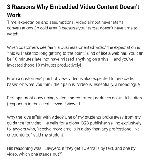
Improve by numbering the points since the headline speaks to a specific number of reasons and use strategic boldface to highlight key copy points.

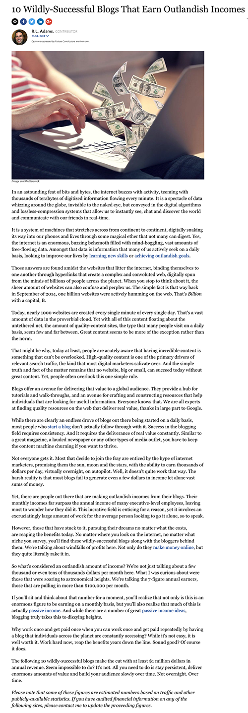
Improve by getting to the point, adding white space to give the eye a rest and use more headlines for skimmers.
