Art & Science of Display Ad Design for Marketers

The display ad network is one of the least expensive marketing channels with the greatest reach. Think about it. Most people visit websites with advertising. Of all the digital marketing channels, if I were to recommend one digital channel to tack onto a direct mail campaign, display advertising would likely be the choice, especially for brand awareness campaigns.
Because websites can be “content noisy,” especially news websites where many eyes go daily, there is an art and a science for designing ads in all the required ad sizes that get served. The ad size that gets served depends on the visitor’s reading environment and screen size. Getting noticed is where the art and science come in.
Display Ad Basics
Supported Display Ad Sizes in pixel width x height (aka Desktop Display):
- 300×250
- 728×90
- 300×600
- 160×600
Supported Mobile Ad Sizes (aka Mobile Display):
- 300×250
- 728×90
Tablet Static Banners:
- 300×250
- 728×90
Because not all ad sizes have a wide enough inventory to include on display campaigns, especially for smaller budgets, we design the following five ad sizes or ask that clients supply creative for the following ad sizes. These are ranked from the most to least served from our past multichannel client campaigns:
- 320×50
- 300×250
- 728×90
- 160×600
- 300×600
The supported file types for all ad sizes are .jpg, .png or .gif. The .png file format is the most common for a static ad (ad that has no movement or animation) as it supports image transparency or can contain a solid color background. The .gif file format supports animation or movement, which attract visitor attention and therefore get more engagement. If there is animation or movement in a .gif, be sure it is tastefully designed so it doesn’t get reported. You want to capture attention without being too distracting.
Here is an example of how a tastefully designed 300×250 .gif loads in frames, ultimately pulling in all visual elements and asking for a click:


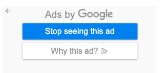
The main message is “free cancellation” and “click to book.” The above ads aren’t obnoxious, but because .gif animated images replay automatically, a visitor could click the “x” and choose to “Stop seeing this ad” if this ad were particularly distracting.

Marketers and advertisers want to minimize clicks to “Stop seeing this ad” as it will mean there will be fewer people to serve their ad to in the future using the Google Display Network. Keep in mind that there are other ad networks used in the display campaigns we do for our clients, so if people click the button in one ad network, it doesn’t impact the others.
Display Ad Design
When starting design, you will want to have the following list of design elements ready to roll:
- Logo (horizontal orientation is best if you have it)
- 4-5 word headline (e.g., Countdown to Black Friday) that makes sense alone if there is no room for a sub headline
- 4-5 word sub headline (e.g., Sale Ends Nov. 26) that adds to the main headline but isn’t required to communicate what your main point is
- Beauty image that adds visual interest
- 1-2 word call to action (CTA) text (e.g., Book Now)
Using reporting data from our past client campaigns, below is a list of average reading environments where ads are getting served:
- 55% Mobile
- 35% PC/Desktop
- 10% Tablet
If you’re presenting multiple design concepts to get to an approved look/feel, it may be best to start with 300×250 then adapt to 320×50 next. If not, then begin design with the below most served ad sizes and then adapt to other sizes:
- 320×50 (smallest size so may only fit a logo, headline, CTA text/button)
- 300×250
- 728×90
- 160×600
- 300×600
You’ll want to be sure that any text on your image is readable when viewed at 100% of the ad size. If there is small text as a part of your logo for instance, you probably won’t be able to read that on a 320×50 ad. You may want to consider using a logo version without that text. Never overload images with info you’re trying to get across. Always approach design with what the viewer needs to know and make it easy for them to see it.
