
Why Marketers Must Pivot to Mobile-First Email Design

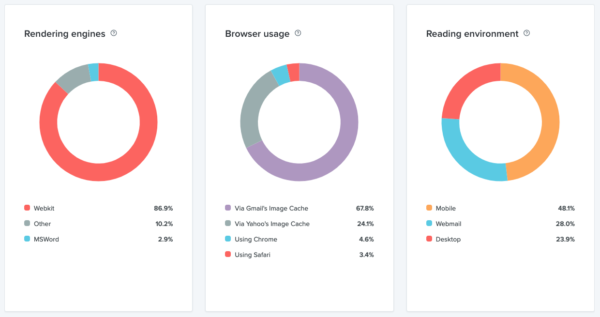
B2C direct marketers who use the email channel to reach targeted individuals are almost always concerned with how an email looks on desktop first instead of how the design looks on mobile. This is a big oversight, because most recipients of email are consuming it on their mobile devices.
We’ve previously discussed the downside of image-based email where the biggest drawback is that for desktop, images with embedded text are typically disabled by default so the recipient doesn’t see your messaging until they take action to download images. More importantly, images with embedded text scale down for mobile and most of the time the text becomes too small to read. This also means it’s not considered an accessible email from an accessibility compliance perspective.
Moral of the story? While you are ensuring most of the content can be seen when images are suppressed for desktop or reduced in size for mobile, you should be designing for mobile first.
This is a switch for most marketers, because in the past you always started with the desktop email design first, routed for approvals, then responsive mobile/tablet design was an afterthought and most of the time, didn’t even get routed for approval. Email design best practices come from years of experience, ensuring that emails render nicely in the majority of reading environments. But when you know that most recipients are consuming emails in mobile rendering environments, you need to change your game.
When designing for desktop first, then adapting that design for mobile, here are the biggest design “aha” moments you’ll have:
- Big hero images visible on mobile versions mean recipients must scroll a lot more to get to your content to learn what’s in it for them. Consider hiding images for mobile that aren’t supporting your main message.
- The amount of text in a call-to-action (CTA) button matters. Less is more. If a CTA button has too much text in it, it starts to look more like a design element than a clickable button. Make sure there is ample white space around your buttons for clicking.
- Create buttons with code only, not an image, so they scale appropriately for mobile.
- Reducing CTA button size or the white space around buttons on mobile may render them not clickable because they are too hard to touch without hitting other elements. Also, again from an accessibility standpoint, people with hands that shake may have difficulty clicking items that are too close together.
- Text embedded in images can become unreadable when images scale down for mobile, especially legalese. Also, text embedded in a graphic is not accessible to a screen reader, so people with low vision or those needing a screen reader, like the blind, will have no access to that information.
- You may need to scale up paragraph text size for mobile versions to be readable. A minimum 16px text is recommended for accessibility, even on the desktop version of your email.
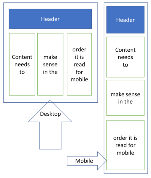
- If the desktop layout has two or more columns that need to stack on top of each other for mobile, the content in those columns when stacked needs to make sense in the order that it is stacked. Multiple columns are hard for screen readers to read; best practices for accessibility would be to use a single column design so screen readers can read the content correctly.
- Too much copy – something that looks good in a desktop view can create a scrolling nightmare for a mobile user. Make sure your content is brief and use only a single CTA for your email. Mobile users see the content as they scroll and do not have the luxury of reviewing the email as a whole, so complicated steps or actions can be lost and it’s irritating to have to scroll up and down to get all the information.
In summary, today, there is every reason to have a mobile-first approach to email design and zero reasons to start with desktop first. If you still begin with desktop, just make sure you also review the mobile design at the same time so you can see how design elements translate to mobile so it doesn’t cause an issue later. If you need help designing, redesigning, coding or recoding your sales or marketing email templates to be mobile first, let’s talk.