
Email Design: WYSINAWYG
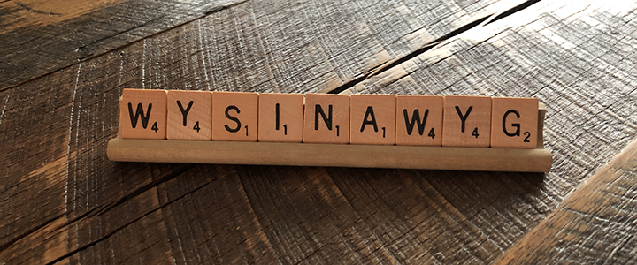
It’s very common on client approval proofs in the print industry that once the design is approved, that’s the way it is going to look. When it comes to hypertext markup language (HTML) email or web page design, that is far from the truth.
A design, most of the time, is presented as a flat graphic that represents how you want your impression to be presented to the end customer. Now come to my campfire and let me tell you the tale of “WYSINAWYG – What You See is Not Always What You Get” when it comes to email or web page HTML.
Think of an HTML file like an Excel spreadsheet. Each cell can have different text or number characters, text/number color, borders, background colors, cell heights/widths, etc. Once you “code” the cell’s formatting into the spreadsheet, save the file and email it to someone else for them to open, you can’t guarantee they see what you see. They might have an old version of Excel that doesn’t support some formatting, different fonts loaded, an old monitor with lower resolution, an odd color balance setting, or viewing on a different size computer monitor, etc. They’re not seeing exactly what you want them to see.
That is what happens when marketers route flat design images that will ultimately become HTML emails or web pages. An HTML email is basically a single web page. Design approval is a start, but then that design needs to be sliced up into little pieces/tables (or cells if we’re still using the Excel metaphor) and coded into a responsive HTML file that responds/flexes the design for different screen sizes and reading environments. From there the HTML file is tested in many different reading environments like Outlook, Gmail mobile app on iOS, etc. The goal is to get the design experience to be as close to the same for all eyes that see it, but you can only go so far.
What might change visually for the end recipient of your email from your original design that you can’t control?
- Font selection or font size
- Where text breaks or wraps in the copy
- If images are shown or hidden
- If design is presented in light or dark mode
- If the design is presented on a smaller or larger screen
- If the design is presented in a mobile app that doesn’t support responsive HTML
- Colors and gradient presentation
- Call-to-action button presentation
That said, when it comes to HTML design, it’s best to see/approve concept design first using a flat graphic with dummy text or Greek (e.g., Lorem ipsum). Once the design has been coded in HTML and all real content added, view the HTML file online in a browser tab, have a test email sent to you and/or best would be to view a rendering report using a tool like Litmus or Email on Acid to see your design in the top supported/used reading environments.
Print is print and HTML is HTML. It’s not possible to force an HTML file to look exactly how you want it to for someone else like you can for print. You can get close, and we’re experts at what can/can’t work when taking print design online. If you need help getting your online assets to look as close as possible to a print piece, let’s talk.