
Does Your Brand’s Logo Look Great in Dark Mode?
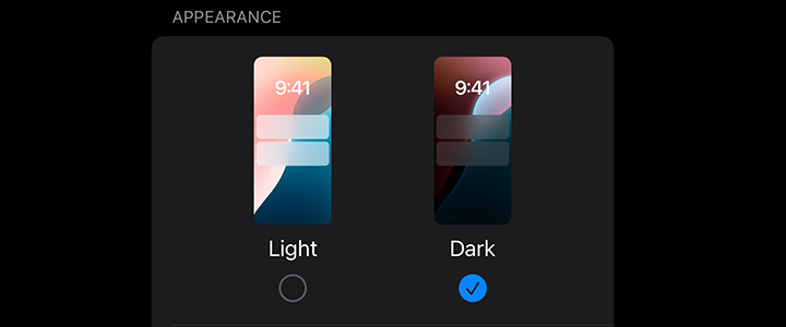
Dark mode is everywhere — from mobile apps and email apps (desktop, mobile & webmail) to websites — and your brand’s logo needs to shine whether it’s on a bright white background or a deep, dark black. If your logo wasn’t designed with dark mode in mind, it might disappear, clash or look awkward against a dark background. Here’s how to make sure your brand’s logo stays crisp and recognizable in dark mode. Here is a typical colored and black-and-white logo. Notice that when it’s saved as a JPG, in dark mode it’s boxed out with white surrounding the logo while the rest converts to black. How can you avoid this?


Left Image: Light Mode JPG Logo
Right Image: Dark Mode JPG Logo – White Box Around
Use a Transparent Background
If your logo has a white or light-colored box around it, it will look jarring against a dark background. Save your logo as a PNG with a transparent background so it can seamlessly blend into any setting. If you have smaller text, such as a black tagline, it might not be readable if it flips to a dark background. If this is the case, you may need to save your logo in the background color you desire, but you’ll need to save the graphic in the full width of your header to avoid a logo that, for instance, sits in a white box surrounded by the black.


Left Image: Transparent Logo in Light Mode
Right Image: Transparent Logo in Dark Mode – Tagline Disappears


Left Image: Light Mode Black & White Logo
Right Image: Dark Mode Black & White Logo – Disappears
Create a Dark Mode Version
A logo that looks perfect in light mode might lose visibility in dark mode. If your logo is dark or has colors that don’t contrast well with a black or dark gray background, consider creating an alternate version with lighter elements. Also, colors in the mid-range tend not to flip dark-to-light and light-to-dark as much.
For best display in an email when the recipient is using dark mode, you may be forced to create a dark mode version when the background goes dark if a transparent image means elements in your logo get lost.


Left Image: Mid-tones Logo in Light Mode
Right Image: Mid-tones Logo in Dark Mode
Add a Light Outline or Glow
For logos with dark colors, adding a subtle white outline, shadow or a background glow can help maintain contrast without completely changing the design. This ensures visibility while keeping the brand identity intact and allows you to use one logo for your designs — the extra outline, shadow or glow will only show up when it flips to dark mode.

Left Image: “Outline” Logo in Dark Mode
Right Image: “Glow” Logo in Dark Mode
Use Alternative Logos for Light and Dark Mode
Modern design tools and frameworks allow for alternative logos that switch based on the background. If possible, set up your website or app to automatically swap in a dark mode-friendly version when needed. Logo swapping is not available for email however, and many popular email clients, like Gmail, ignore light and dark mode and create their own version of your logo’s colors.


Left Image: Original Logo in Light Mode
Right Image: Adaptive Logo in Dark Mode
Test in Different Backgrounds
Your dark mode logo shouldn’t just look good on pure black. Many apps and websites use dark grays, blues or even warm-toned dark backgrounds. Test your logo in multiple dark shades to ensure it remains legible and visually appealing.
Dark mode isn’t just a trend — it’s a necessity for digital branding. Making sure your logo adapts well ensures consistency, professionalism and a better user experience. By using transparency, contrast and smart design choices, your brand’s identity will stand out no matter what mode your digital audience prefers.
Want help optimizing your logo for dark mode? Let’s talk!
Patti Bassett • February 19, 2025