
Direct Response Landing Page Design Pro Tips

What inbound and outbound marketing have in common are direct response landing pages where visitors can take a path to your call to action (CTA). Designing that direct response landing page is an art and more so a science than ever before.
You can have the coolest email design, amazing display ads and clever social ads, but what they all drive eyes to is a direct response landing page requiring someone to do something to convert. Basically, you need to lead a horse to water and hope they drink. So, what CAN you do to optimize your response page to convert?
A response page can only do so much if there isn’t first a respect for the brand, need for your product/service, an attractive offer and an easy way to take action. So, let’s assume that there is awareness of your brand and that consumers have a positive perception of your brand. Let’s also assume that the offer is attractive and incents consumers to act in a specific time frame. That’s already a lot of assumptions before you even task your creative team to design the response page, so let’s review:
- Brand awareness
- Positive perception of your brand
- Need for your product or service
- Attractive offer
- CTA with an offer end date
Now, let’s drill into the response page design. Here are suggestions from our design team, backed by studies and years of reporting data from past campaigns we’ve executed:
Put offer front, center and “above the fold.”
The creative that drives interested visitors to a response page has the offer front and center. Therefore showcase the offer details on the top of the page, including the offer end date. Don’t make people scroll and hunt for the information by using that prime area to educate visitors on what makes you better than your competition, your COVID-19 processes or other products you also sell that aren’t included on the offer. You can have those things on the page, but put them below the offer details and the response form.
Another suggestion is to touch on basic details of what information your prospects ask about when they are in the consideration phase of their customer journey with you. What is the typical price range, and what factors contribute to the price being on the low or high end of that range? Is there a typical timeline so prospects know what to expect when working with you?
Ask for the minimum number of fields you need.
It’s tempting to ask for additional fields because you want to gather information that you can use now, but more importantly in the future. There is a sweet spot on the number of fields to collect on a response page to maximize conversions though. If you have a quantity goal for form submissions, stick with 1-3 fields. If you have a quality goal, stick with 3-5 fields, but you can expect fewer submissions. If you want to collect more fields than that, we suggest a two-part form where the first submit collects the minimum you need to contact a lead and a second voluntary form to collect additional information if users are willing to offer that information. By doing it in two parts, you can get the minimum information you need before the process could be abandoned.
Avoid making too many fields required.
Keep the number of required fields to an absolute minimum of what you would need to make contact. If you are using the fields to qualify that someone is eligible for the offer, then we suggest taking a step back and defining the audience by eligibility requirements first and only serving impressions to the matched audience that meets the criteria. We call that Multichannel Direct where we only send display, social, email, direct mail, OTT/CTV or programmatic audio impressions to the exact individual you want to target.
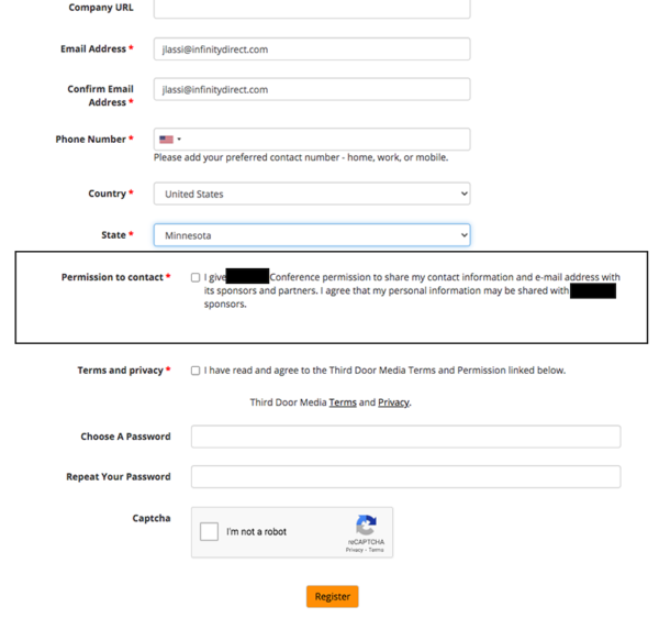
Never make express consent, email opt-in or contact sharing checkboxes required.
I recently came across a virtual conference that I was interested in attending, and when I clicked through to the response page, unless you checked the “Permission to Contact” checkbox, you were not able to submit the form since it was a required field. I understand the need to do this for a “Terms and Privacy” statement, but the “Permission to Contact” specified that my information would be shared with sponsors and partners. With any conference or webinar, it’s pretty standard that info is shared with sponsors of the event, but partners can mean anything, and that could mean your phone starts blowing up with sales calls. No thanks. My phone blows up enough as it is with unknown numbers.
Keep it Stupid Simple (KISS) – Less is More
Avoid having paragraphs of copy that eyes can’t easily skim. Give visitors the baby first, then some labor if they want to drill deeper. This is often a challenging concept for marketers since they want the most information they could possibly get on a page “just in case they’re interested.” There are ways to creatively tuck away additional copy instead of creating a long page requiring a long scroll, such as using accordion pop-outs or “mouse over” pop-outs to display additional information to interested visitors. That also helps to keep the response page on target while the offer stays clear and concise.
Jenny Lassi • August 27, 2020