
Email Design Quick Reference Guide
With more screen sizes, from mobile to desktop, email templates need to respond or adapt nicely for multiple sizes. They also need to factor in new ways recipients consume your email considering accessibility and the voice age. When designing an email, there are a lot of details to take into consideration – some of which you may not be aware of… yet.
Here are our recommendations that help you reach an inbox (not spam folders) and that once the email is opened, help everyone see your email on their screens, hear your email if they use screen readers, and ultimately engage with your email by clicking on your call-to-action (CTA) text links and/or buttons.
Do:
- Use a single-column fluid layout where the template width is at or around 600px wide.
- Build your layered email design in a .PSD or .AI file.
- Convey your message in the text of the email body.
- Use solid background colors behind text or images while making sure there is enough contrast between the background color and text or image.
- When using background colors, keep in mind how those will look if the recipient of your email is using dark mode.
- Use web-safe fonts or choose a matching Google font if you’re trying to match to a brand standard print font as closely as possible.
- Always define a font-family for the text in case a recipient doesn’t have the first font you used in your design. When your design is coded into HTML it would look like “font-family: ‘Open Sans’, Arial, sans-serif.”
- Keep font sizes at 14px for desktop – never less than 12px for your main body copy. Serif fonts lose readability the smaller you go, so beware if you use a serif font for disclosures, terms and conditions or legal text.
- Learn more, read more and CTA buttons should be HTML buttons (editable text over a solid background color) and not a button that is a hyperlinked image.
- AB test the use of animated GIF images while always using a fallback image for those who can’t see animation in their email clients.
- Use image alt text that makes sense when read out loud to describe what the image is.
Don’t:
- Convey your main message in an image.
- Send image-only emails as a shortcut to get something out quickly.
- Use text embedded into full-width images that become unreadable when images scale down to mobile.
- Embed a lot of text in images that isn’t using a web-safe font as the combination of text in the email body and text in images won’t match.
- Create a complicated background design that creates noise where a recipient’s eyes won’t know where to look first.
- Use text or images over the top of background images as background images don’t have universal support in all email clients.
- Use a gradient color behind a CTA button. That would need to become a background image with editable text, and background images don’t have universal support in all email clients.
Before You Roll (or Design)
Before you begin to design your email, it is helpful to know what rendering environment you are designing for. If you have previously sent an email to the audience that used a tool like Litmus analytics, you can see what recipients use when reading your email, then design for the majority.
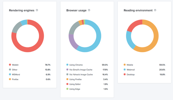
The above is a good representation of a typical B2C audience where the majority of recipients are using a mobile device and the smallest percentage are using a desktop email client like Outlook. In this case, absolutely design with a mobile first approach.
For a typical B2B audience, the majority of recipients are using desktop and webmail email clients and less than half are using mobile email clients. Because of this, design for desktop first, with a solid mobile experience. What this means is that you shouldn’t use animated images, background images and embedded video that don’t have universal support on desktop email clients without having fallbacks in place.
If you want help with your email design and don’t want to worry about all of this, let’s talk.